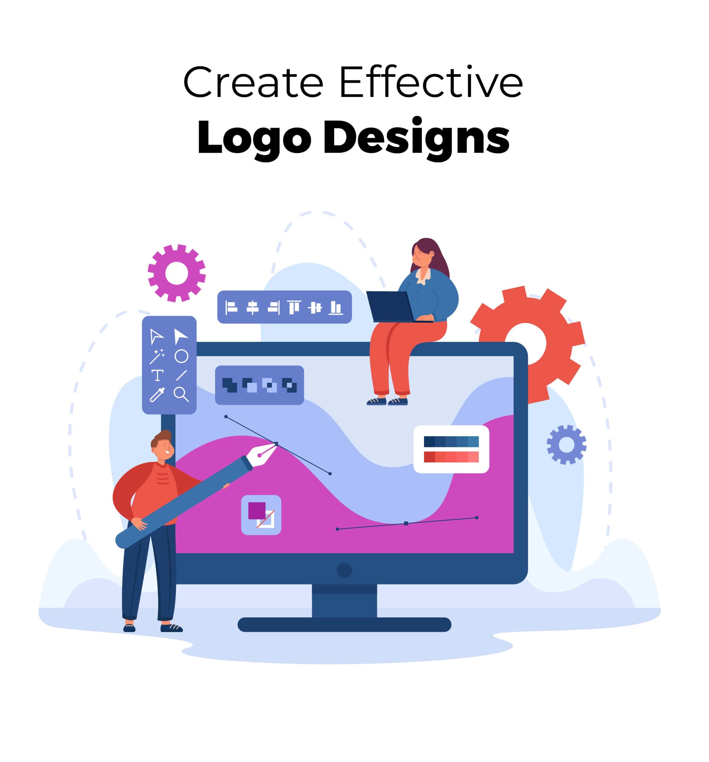
The Hidden Language of Logos: Decoding the Psychology of Color and Shape in Design
Logos influence our perceptions of brands in today’s visually driven society. But have you ever wondered why some logos capture our attention and create a lasting impression? The solution can be found in the intriguing world of logo design psychology, where colors and shapes wield enormous influence. A hidden language exists behind every well-crafted logo, capable of generating specific emotions, creating associations, and influencing consumer behavior. In this post, we’ll go on a trip to unravel the psychology of color and shape in logo design, revealing the secrets that turn logos into more than just beautiful elements but effective communication tools. So, prepare to go into the depths of logo design as we reveal the hidden language that communicates directly to our subconscious thoughts.

The Effect of Various Colors On Emotions And Perceptions
Colors have an extraordinary ability to elicit emotions and affect our perceptions. Each hue has a distinct psychological influence; knowing these impacts is essential in logo design. Warm hues, such as red and orange, generate sensations of enthusiasm, passion, and energy. They can draw attention and create a sense of urgency. Cool hues, on the other hand, such as blue and green, frequently express a sense of tranquility, trust, and dependability. These colors are frequently used in finance, healthcare, and technology industries.
Color Symbolism and Cultural Associations
Colors also have cultural connotations and meanings, which vary depending on place and society. White, for example, is typically connected with purity and simplicity in Western civilizations, yet it may represent loss and grief in Eastern traditions. Similarly, in certain cultures, red represents luck and prosperity, but it may indicate danger or warning in others. When creating a logo for a worldwide audience, it is critical to consider cultural meanings and ensure that the colors chosen are consistent with the desired brand image.
Color Psychology and Its Use in Logo Design
Color psychology is important in logo design because it allows designers to elicit various emotions and affect consumer behavior purposefully. Designers can strengthen brand messaging and build a strong visual identity by carefully picking colors. For example, Colors like yellow can represent enthusiasm and optimism, making them ideal for brands aimed at a younger demographic. On the other hand, muted and earthy tones can be used to generate a sense of tranquility and environmental sensitivity, making them great for eco-friendly brands.
Speak Volumes with Logo
Are you ready to climb new heights?
Great adventures await!


Geometric Shapes’ Psychological Impacts
Geometric shapes have a big impact on our psychology and perception. Each shape has its own meaning and elicits different emotional responses. Squares and rectangles, for example, are associated with stability, equilibrium, and dependability. They are often employed in areas such as finance and real estate to convey a sense of professionalism. Circles and ovals, on the other hand, indicate unity, harmony, and inclusivity. These forms frequently inspire a sense of friendliness and community, making them ideal for brands that emphasize social connections and connectivity.
The Effect of Curves Versus Straight Lines on Emotions
Using curves against straight lines in logo design can elicit various emotional responses among viewers. Curved lines, such as those found in circles and arcs, exude fluidity, tenderness, and approachability. They have the ability to elicit sensations of warmth, comfort, and creativity. Straight lines, such as those seen in squares and triangles, on the other hand, indicate stability, structure, and assertiveness. They have the ability to instill professionalism, strength, and efficiency. Designers can influence the emotional tone of a logo and link it with the intended brand personality by strategically using curves or straight lines.
Shape Symbolism and Its Application to Logo Design
Shapes also have symbolic implications that can be used to support brand messaging in logo design. Triangles, for example, frequently indicate growth, desire, and upward movement. They can be used in logos for brands that want to show innovation and foresight. Furthermore, organic shapes influenced by natural forms such as leaves or waves can elicit feelings of harmony, sustainability, and environmental awareness. Understanding the symbolic implications of forms enables designers to develop logos that visually represent the essence and values of a business, resonating on a deeper level with the intended audience.
The Psychology of Logo Design: Understanding the Impact of Color and Shape
How we see and interact with logos is greatly impacted by complex psychological processes underneath the surface components of color and shape. Following are some of the things to understand better.
Creating Aesthetic Harmony by Combining Color and Shape
The art of logo design is in establishing visual harmony by blending color and shape. Designers strive to achieve a balance that both enhances the overall aesthetics and delivers the intended message when blending colors and shapes. Complementary hues, for example, which are opposite each other on the color wheel, can produce a visually appealing contrast that adds life and energy to a brand. Similarly, combining geometric shapes with colors that complement each other in terms of tone and intensity might result in a visually pleasing design. Designers may develop logos that catch attention and leave a lasting impression by effectively balancing color and shape.
Why Should
You Choose
LogoverseInc?
LogoverseInc is one of the leading firms in the USA.
We offer extensive services for logo design, mobile apps,
web design, branding, eCommerce, and NFTs
to uplift your success.
We Are Here To Help
Color And Shape for Brand Identification
Color and shape selections are critical in conveying a brand’s character and personality through its logo. Designers can build a visual language that resonates with the target audience by connecting color and shape with the brand’s key values. A tech business, for example, may choose a sleek and minimalistic logo with clean lines and cool, futuristic hues to express innovation and modernity. A children’s toy brand, on the other hand, may use whimsical forms and brilliant, warm colors to inspire a sense of delight and inventiveness. The use of color and shape strategically guarantees that the logo becomes a compelling expression of the company’s identity and contributes to the establishment of a strong brand image in the minds of consumers.
Color-Shape Dynamics of Successful Logo Designs
Examining case studies of great logo designs can provide useful insights into the effective use of color and shape. We can learn how these logos contribute to brand identification and success by evaluating the color and shape dynamics. The iconic Nike Swoosh, for example, blends a simple curving design with a bright, dramatic black color to signify movement and athleticism. Similarly, the Coca-Cola logo uses a strong red hue to stimulate appetite and a unique script font to lend nostalgia and vintage elegance. We may learn from real-world examples of how color and shape choices influence the perception and effect of a logo by looking into these case studies.
Make Your Mark and
Leave a Lasting Impression
on the Audience
Our expert designers and developers collaborate
with you to understand your project goals,
target audience and drive tailored
strategy for your business success.


Providing Animation Services To
Clients In Multiple Cities Across USA & Canada
- Arlington
- Cleveland
- Jacksonville
- Miami
- Orlando
- Atlanta
- Dallas
- Louisville
- Minneapolis
- Philadelphia
- Austin
- Denver
- Kansas City
- New York
- Portland
- Chicago
- Houston
- Los Angeles
- New Orleans
- San Diego
Practical Tips for Effective Logo Design
Designers can create logos that communicate the brand’s essence, resonate with the audience, and remain effective across applications by knowing the target audience, harmonizing color and shape with brand values, and guaranteeing scalability and versatility. These practical tips improve logo functionality and impact, elevating the brand’s visual identity.
Understanding Your Target Audience’s Psychological Preferences
An effective logo begins with a thorough understanding of the target audience’s psychological preferences. Investigating the target audience’s demographic, cultural, and psychographic features provide significant insights into their tastes, values, and emotions. By understanding their preferences, designers may build a logo that resonates on a subliminal level. If the target audience is youthful and trend-conscious, vivid and vibrant colors mixed with modern, dynamic forms may be more enticing. Understanding the psychological inclinations of the target audience allows designers to create a logo that attracts attention and forges a relationship.
Aligning Color and Shape with Brand Values and Messaging
Color and design choices should complement the brand’s values and messaging. A logo visually represents the brand’s identity, and the colors and shapes convey vital meanings. For example, a firm that wants to radiate credibility and professionalism would use a blue color palette with clean, straight lines. On the other hand, a brand stressing creativity and invention may use brilliant and uncommon colors with unique and organic shapes. Designers may build a logo that becomes a compelling representation of the business’s identity and effectively communicates its fundamental essence by consciously harmonizing color and shape with brand principles.
Ensuring Logo Design Scalability and Versatility
A good logo design should be scalable and adaptable to many applications and sizes. The emblem must be identifiable and legible, whether placed on a billboard or a small mobile device. During the design process, designers must consider scalability to ensure that detailed elements or tiny lines are not lost when the logo is scaled down. An adaptable logo may also adapt to numerous color spaces and backdrops while still maintaining its power and clarity. Designers enhance the lifespan and adaptability of their logos by designing them to be scalable and versatile.
Logo psychology shows how color and shape affect our perceptions, emotions, and associations. Designers can use this knowledge to create logos that attract and resonate with the intended audience. Color and shape help brands convey their values, personality, and messaging. LogoverseInc can help you design a compelling corporate logo. Our designers know logo psychology and can create a logo that accurately portrays your brand. Contact us immediately for excellent logo design and boost your brand.